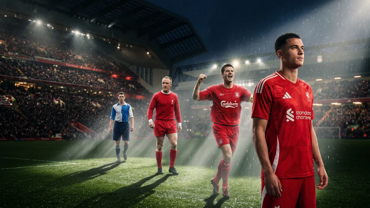
Take a glance at Liverpool's first playing kit from 1892, and without context, you'd be hard-pressed to identify the club. The blue and white quarters, dark blue shorts, and socks bore little resemblance to the familiar 'reds'. For modern fans, the all-red ensemble seems more than a choice; it feels like an unbreakable football law. However, the journey to this iconic look spanned decades of evolution, tactical experimentation, and notable victories.
1892–1896: A kit that didn’t look like Liverpool
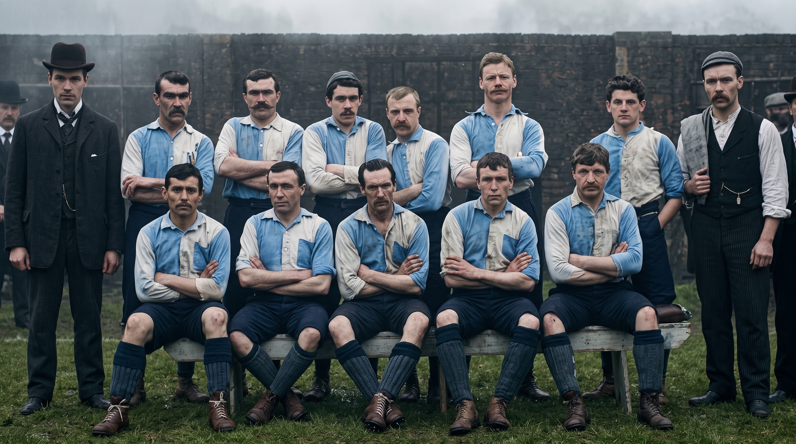
The club's story began in 1892, following a split at Anfield, leaving behind the old Everton kit. The players took to the pitch in heavy cotton rugby jumpers split into blue and white quarters, devoid of numbers, names, or any club crest. Museum historians confirm that the emblem from the club’s 1892 stationery, which appears on modern replicas, was absent from the original playing shirts. The first four years showed that red wasn’t initially destined to be Liverpool's colour; Anfield could very well have remained blue and white.
1896–1964: The arrival of the red top and white shorts
In 1896, the club donned its first red shirts, paired with white shorts. This fundamental design was preserved for nearly seventy years, despite ongoing changes in shades, collars, and socks.
The famous Liver bird was initially created for the 1950 FA Cup final, though it made its debut a week earlier in a match against Portsmouth. For some time, the emblem was only sporadically applied to away kits, with the oval crest featuring the Liver bird making its permanent home on the home red shirt in November 1955. The bright red top paired with white shorts at that time created a disjointed look that left the club's identity feeling incomplete.
1964–1973: Bill Shankly's two-step revolution
A popular myth suggests that legendary manager Bill Shankly transformed the team into an all-red outfit overnight. In reality, the overhaul took two matches:
- November 25, 1964: Ahead of a home European Cup tie against Anderlecht, Shankly asked captain Ron Yeats to try on red shorts that matched the shirts. The manager was thrilled, believing that red conveyed danger and intimidated opponents while visually amplifying the players. The match ended with a 3-0 victory, but the team still wore white socks.
- December 16, 1964: In the return leg against the Belgians, the kit was completed with red socks. Roger Hunt scored the winning goal in the closing minutes, and by May 1965, Liverpool lifted the FA Cup at Wembley for the first time in their history dressed fully in red.
This unified monochromatic look made the team appear more formidable, cohesive, and instantly recognisable on the global stage.
1973–1985: The Umbro era and the debate over stripes
The brand Umbro had been crafting Liverpool's attire long before 1973, but it was that year when the iconic double diamond logo became a staple in the design. In this kit, the Merseysiders clinched four European Cups (1977, 1978, 1981, 1984).
In 1979, the Japanese company Hitachi became the club's first-ever title sponsor, replaced in 1982 by Crown Paints. It was during the 1982/83 season that subtle white pinstripes appeared. Many conservative fans reacted negatively to the stripes, insisting on a strictly monochrome kit, yet the treble-winning season of 1983/84 (with the league title, League Cup, and European Cup success) secured in the striped kit silenced all dissenters.
1985–1996: The Adidas, Candy, and Carlsberg era
In 1985, Adidas became the technical sponsor, while in 1988, Candy took on the title sponsorship. The pinnacle of designer audacity came with the home kit from the 1989–1991 seasons, featuring a complex geometric white pattern, three signature stripes, and a substantial collar. It was in this kit that the club won the 1989/90 league title – their last before a 30-year drought.
From 1992, Carlsberg’s green and white logo graced players’ chests for a solid 18 years, linking various generations of heroes from Robbie Fowler and Michael Owen to Steven Gerrard and Fernando Torres, it became a landmark in the club’s culture.
1996–2015: A decade of Reebok, the Istanbul miracle, and Warrior experiments
From 1996 to 2006, Reebok produced the kit. The classic red kit with white trim became immortalised on May 25, 2005, during the famous Istanbul comeback from 0-3 against AC Milan, with goals from Gerrard, Smicer, and Alonso, as well as Jerzy Dudek's saves in the penalty shootout, turning this simple shirt into a revered relic.
This was followed by a return to Adidas (2006-2012) and a contract with Warrior, who reinstated a sleek retro silhouette of the Liver bird in gold. In 2015, the parent company shifted the club's contract under its flagship brand New Balance.
2015 to present: Klopp's golden era, Nike, and Adidas' third return
The New Balance era is closely linked with the triumphs of Jurgen Klopp, Mohamed Salah, Sadio Mane, Roberto Firmino, and Virgil van Dijk:
- Victory in the 2019 Champions League came in a deep maroon kit.
- In the 2019/20 season, a kit featuring thin stripes was created to commemorate Bob Paisley’s 100th birthday, harkening back to the 1982/83 season. It was in this kit that the team finally clinched the long-awaited Premier League trophy. Due to the pandemic, the season stretched until July 31, 2020, allowing the team to lift the trophy in the New Balance gear just a day before the contract with Nike officially began.
From 2020 to 2025, the club was outfitted by the American conglomerate Nike, and on August 1, 2025, a historic third partnership with Adidas will begin, set to last ten years. The home kit for the 2026/27 season will see the return of the iconic geometric pattern from 1989-1991, combining nostalgia for older fans with modern technologies.
